
Interactive platform for real-time functions and business tools. Combines frontend and backend systems with custom workflows. Best for internal dashboards, SaaS tools, or platforms.
Services
Product Design, UI/UX, Frontend & Backend Dev
Tools
React, Figma, Node.js, Firebase
Value
Custom functionality, seamless experience
Timeline
3–5 weeks
Ideal for
Custom platforms, internal tools
Investment Level
High

Hero & Primary Call-to-Action
The hero section immediately establishes SwiftPay’s value proposition with a concise yet powerful message. The headline—“Superfast and effortless payments”—uses bold, sans-serif typography to convey speed and modernity, promising users a frictionless transaction experience. Directly beneath, a brief subtext reinforces this promise by highlighting both the platform’s seamless security protocols and its rapid processing times, assuring visitors that they can trust SwiftPay with their most sensitive financial activities.
Anchoring the call-to-action are two prominent buttons—“Download on the App Store” and “Get it on Google Play”—each styled in their respective brand colors to leverage familiar trust signals. These buttons sit side by side, separated by just enough whitespace to prevent visual clutter while ensuring equal prominence. Subtle hover and focus effects (such as a slight scale-up or shadow) on each button create a tactile feel, inviting clicks and improving accessibility for keyboard and screen-reader users.
The background for this section—whether a sleek abstract graphic or a muted photo of someone effortlessly tapping their phone—provides visual context without distracting from the text. Generous padding around the copy and buttons ensures that the layout feels open and approachable, while responsive design considerations guarantee that on smaller screens, the headline, subtext, and download buttons stack neatly, keeping everything thumb-friendly. By combining a clear value statement, trusted app-store badges, and thoughtful interactive cues, this hero area not only captures attention but also guides users seamlessly toward installing SwiftPay.

Real-Time Metrics & Social Proof
The metrics section drives home SwiftPay’s scale and reliability with instantly digestible figures. Two prominent counters—“5.9 M+ Daily Transactions” and “8.9 M+ Daily Transactions”—highlight the platform’s capacity to process millions of payments each day, signaling both robustness and widespread user trust. Placed alongside these figures is the aggregated user rating—“4.6 / 5 from 600+ reviews”—which serves as a quick social proof checkpoint, demonstrating that a large community of customers consistently rates their experience highly.
Visually, each metric is set in oversized, high-contrast type to ensure it stands out even at a glance. Subtle supporting labels (e.g., “Daily Transactions” or “User Rating”) clarify the context, while spacing and alignment keep the layout clean and balanced. Together, these bold statistics give prospective users immediate confidence in SwiftPay’s performance and reputation—showing not just what the product can do, but how many people already rely on it day in and day out.

Comprehensive Feature Suite
This section breaks down SwiftPay’s most powerful tools into a series of clean, icon-driven cards that make each capability immediately understandable:
Advanced Filters: A funnel icon represents precision search, allowing users to slice and dice transactions by date, amount, client, or custom tags—so finding that one invoice from three months ago takes seconds, not minutes.
Streamlined Receivables: An invoice-and-arrow icon highlights automated reminders and one-click payment links, cutting down on manual follow-ups and accelerating cash flow by nudging clients gently until invoices are settled.
Powerful Analytics: A bar-chart icon introduces real-time dashboards and customizable reports that visualize revenue trends, top-performing clients, and outstanding balances—empowering businesses to make data-driven decisions at a glance.
Dynamic Savings Tools: A piggy-bank icon signifies built-in algorithms that analyze spending patterns and suggest optimal times to move surplus funds into high-yield accounts, helping users maximize returns without lifting a finger.
Uniform typography, consistent padding, and hover animations (cards lift slightly to indicate interactivity) ensure the grid feels cohesive and intuitive. Each “Learn More” link at the bottom of a card offers a gateway to deeper documentation or short demo videos, turning a static overview into a dynamic exploration of SwiftPay’s full potential.
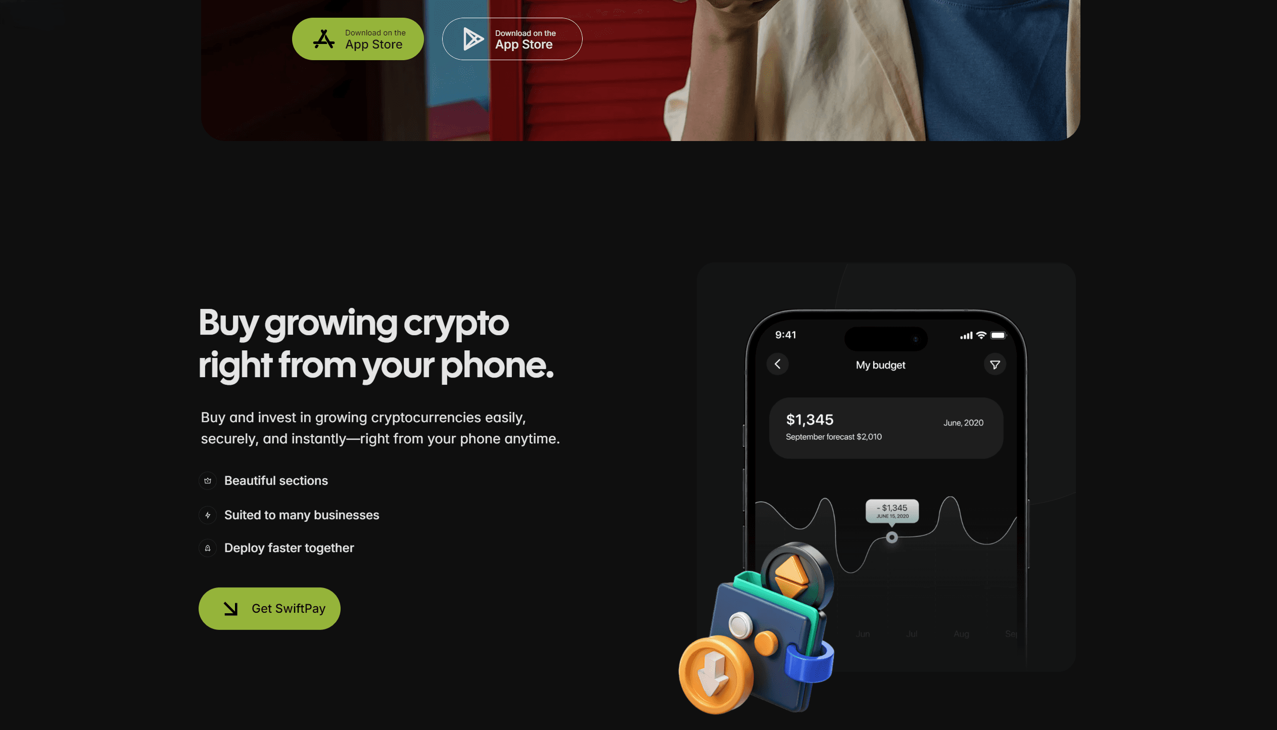
Instant Crypto Purchases
Users can purchase the latest, high-potential cryptocurrencies directly from their mobile device in just a few taps—no desktop required. The intuitive in-app marketplace presents live price charts and smart order types (market, limit, and recurring buys), so you can act on market movements instantly. Integrated identity verification lets new users onboard in minutes, while embedded payment rails support multiple funding options—from bank transfers to credit cards—with transparent fee breakdowns at checkout. Real-time confirmation alerts and a secure wallet vault ensure your newly acquired tokens land safely in your account the moment the transaction settles. Whether you’re adding to an existing position or exploring emerging assets for the first time, this mobile-first workflow makes crypto investing fast, simple, and secure—empowering you to grow your portfolio anytime, anywhere.
Global Navigation & Legal Links
The footer anchors every page with a well-organized, four-column layout that ensures users never feel lost, no matter where they are on the site. Under Product, visitors find quick links to core platform pages—Features, Integrations, Security—so they can dive deeper into what makes the service tick. The Company column offers pathways to About Us, Careers, and Press, inviting curiosity about the team and culture behind the product. In Support, links to the Help Center, Developer Docs, and Community Forums mean answers are always just a click away, reducing friction for both new and veteran users. Finally, Legal houses essential policies—Privacy Policy, Terms of Service, GDPR Compliance—demonstrating transparency and commitment to user rights. Below these columns, a row of social-media icons connects customers to the brand’s Twitter, LinkedIn, and Discord channels, fostering ongoing engagement and real-time updates. A concise “Contact Us” line provides an email link and phone number, ensuring any questions or feedback can be routed directly to the right team. The entire footer is framed by a subtle dividing line and finished with a small copyright statement (“© 2025 FlowMetric, Inc. All rights reserved.”) that reassures visitors of the company’s professionalism and longevity. Generous spacing, consistent typography, and a neutral background color keep the design clean while making each link easy to scan—delivering both form and function at the very bottom of the page.
