
Content-rich site for publishing news, blogs, and articles. Supports categories, multimedia, and user interaction. Ideal for digital magazines, publishers, and influencers.
Services
UX Architecture, CMS Setup, Content Design
Tools
WordPress, Figma, Adobe CC
Value
High-volume content delivery, modern UX
Timeline
2 weeks
Ideal for
Online publishers, news brands
Investment Level
Moderate to High

Header & Category Navigation
The header immediately establishes REPORTLY’s identity and editorial structure with several key elements working in harmony. At the left, the bold, all-caps logo “REPORTLY” sets a confident tone and serves as an ever-present anchor that links back to the homepage. Running horizontally beside it are primary navigation links—Home, All Posts, Business, Technology, Economy, Fashion, Author—each using clear, intuitive labels so readers can instantly zero in on their areas of interest without hunting through submenus. On the right side of the bar, a streamlined search field invites visitors to type keywords and filter the entire archive in real time, making it effortless to locate deep-dive analyses, breaking news, or specific author bylines. The combination of strategic logo placement, logically grouped categories, and an always-available search tool not only accelerates content discovery but also reinforces trust: readers see at a glance that REPORTLY is a well-organized, professional news outlet that values both clarity and accessibility. Consistent typography, balanced spacing, and a subtle hover effect on each link further enhance usability, ensuring that even first-time visitors feel right at home navigating the site.
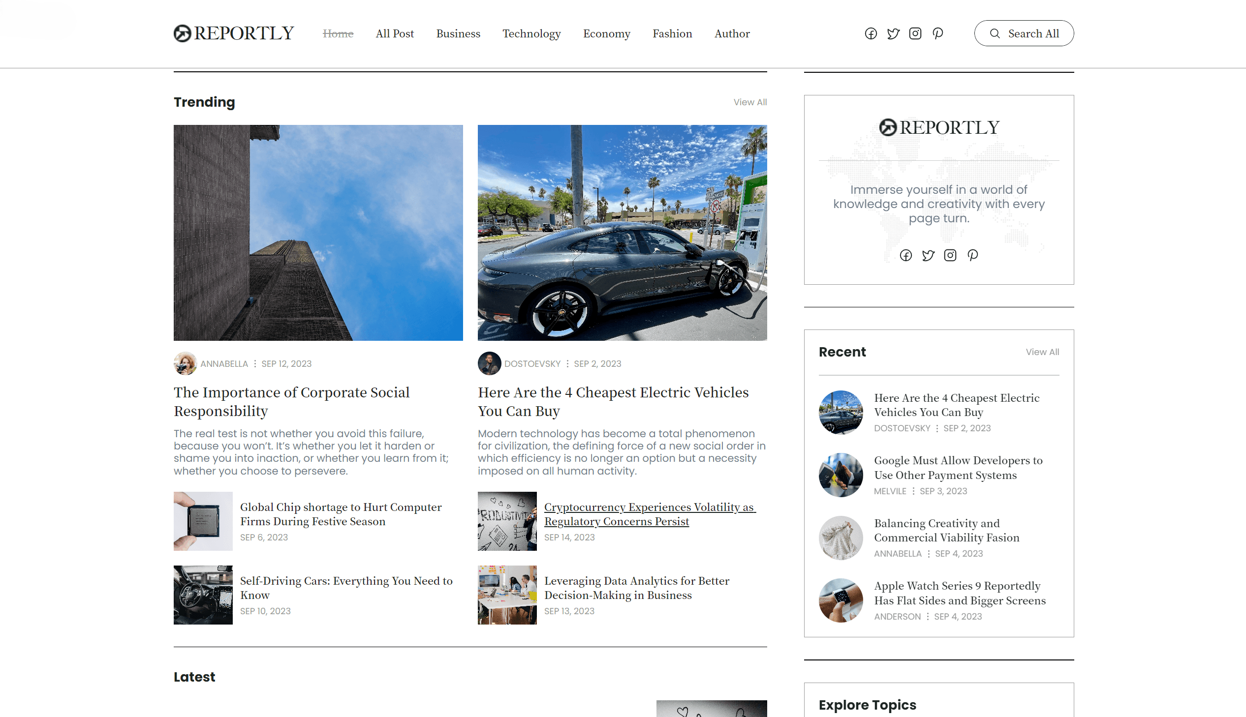
Featured Posts Slider
The featured stories carousel puts top articles center stage in a dynamic, interactive slider. Each slide showcases a large, high-resolution thumbnail that visually anchors the story, accompanied by a bold headline and its publication date to reinforce timeliness. Navigation arrows on either side—and optional pagination dots below—let readers manually scroll through the highlights at their own pace, while a subtle autoplay gently rotates slides for passive viewers. Thoughtful pause-on-hover behavior ensures that readers can stop on any story to absorb the details without feeling rushed. Consistent image aspect ratios, overlay gradients for text legibility, and concise captions all work together to create an engaging preview that drives clicks into full articles. By combining rich visuals, clear metadata, and intuitive controls, this carousel not only surfaces must-read content but also encourages deeper exploration across the site’s top stories.
Editor’s Pick
The “Editor’s Pick” section shines a spotlight on exceptional journalism hand-selected by the editorial team. Each featured story appears as a compact card with a striking thumbnail image that hints at the article’s subject matter—whether it’s an in-depth analysis of market trends, an investigative report, or a compelling human-interest piece. Overlayed atop the image, a bold category tag (e.g., Business, Technology, Culture) immediately signals the topic, while the author’s name and the precise timestamp (“By Jane Doe • Mar 28, 2025, 10:15 AM”) appear just below the headline to lend credibility and context.
The layout uses generous white space and consistent typography to ensure readability, with subtle hover highlights that invite readers to dive deeper. By presenting these stories in a distinct, visually cohesive block titled “Editor’s Pick,” the site not only elevates its best content but also guides readers toward high-quality, curated narratives they might otherwise miss. This blend of thoughtful curation, clear metadata, and engaging visuals helps establish REPORTLY as a trusted source where discerning readers can quickly find the most impactful articles.

Latest News
The “Latest” feed functions as REPORTLY’s real-time pulse, delivering freshly published articles in strict reverse-chronological order so readers are always up to date. Each entry appears as a streamlined list item featuring: Headline: Set in clear, bold type to grab immediate attention and summarize the story’s core angle in just a few words. Excerpt: A two- to three-sentence teaser that distills the article’s key points—whether it’s breaking news, market insights, or expert commentary—helping readers decide at a glance what to read next. Publication Date: Displayed in a subtler style (e.g., “Apr 30, 2025 • 3:45 PM”) to underscore timeliness and reinforce the feed’s role as REPORTLY’s freshest content hub. Subtle separators maintain visual hierarchy and ensure each story stands apart, while an unobtrusive “Load More” button at the bottom lets readers scroll through the archive without overwhelming the page. By marrying concise headlines, meaningful excerpts, and precise timestamps, this section makes it effortless for audiences to stay informed and dive straight into the news that matters most—transforming each visit into a quick, yet comprehensive, catch-up session.
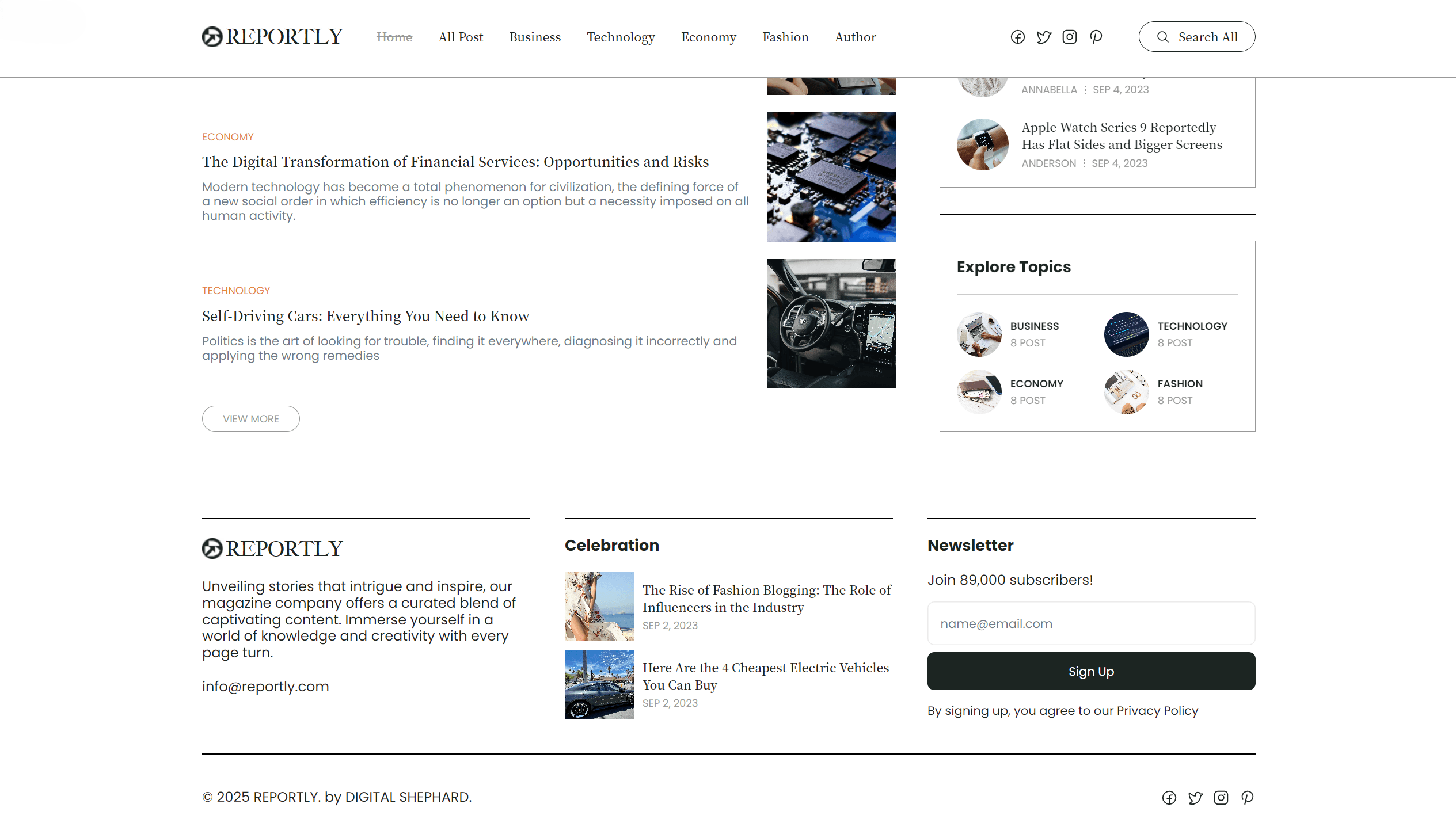
Explore Topics & Footer
The “Explore Topics” section provides a visually engaging road map to REPORTLY’s core coverage areas. Organized into a clean, evenly spaced grid, each category tile features a bold label (Business, Technology, Economy, Fashion) paired with a small badge indicating the current post count—letting readers immediately see both what’s available and how active each vertical is. Hover states subtly shift the tile’s background or reveal a brief description of the category’s focus, encouraging users to explore further. Beneath the grid, the footer closes out the page with a concise site tagline that reinforces REPORTLY’s editorial mission, alongside a contact email link that invites reader feedback and media inquiries. Ample whitespace and consistent typography ensure this final section feels like a natural extension of the page rather than an afterthought, giving visitors clear pathways to dive deeper or reach out directly for more information.
