
Digital learning platform with courses, content, and user management. Supports interactive tools and structured learning paths. Ideal for schools, trainers, and e-learning startups.
Services
UX Design, LMS Integration, Content Structuring
Tools
Moodle, WordPress, Figma, Adobe CC
Value
Scalable learning platform, user engagement
Timeline
2 weeks
Ideal for
Schools, tutors, e-learning platforms
Investment Level
Moderate
Hero & Call-to-Action
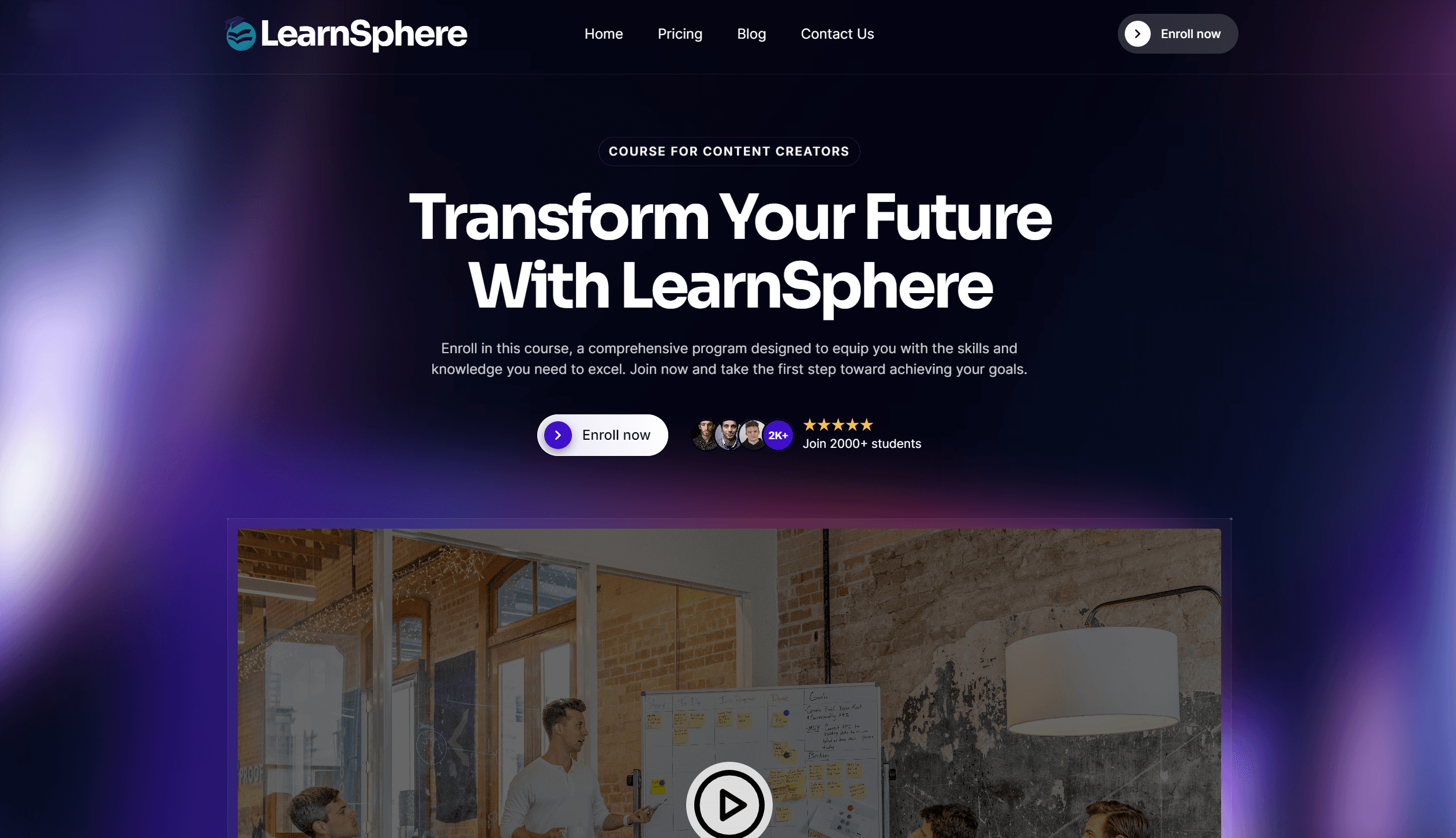
The hero section grabs immediate attention with a striking headline—set in large, bold type—that clearly states the platform’s promise (e.g., “Empower Your Learning”). Directly below, a concise sub-headline reinforces that message by highlighting how users will benefit (“Flexible, expert‐led courses at your own pace”). Together, these two lines establish both who you serve and what you offer in an instant.
Framing the text is a visually compelling background—whether an aspirational photograph of learners or a subtle animated gradient—that conveys energy and focus without distracting from the message. The “Start Learning” button sits front and center, styled in the brand’s accent color to contrast sharply against the backdrop. Its size and placement make it impossible to miss, while a gentle hover effect (such as a slight scale or color shift) signals interactivity and entices clicks.
By combining clarity of purpose, concise benefits, and an irresistible CTA, this hero area not only draws visitors in but also gives them a direct, low-friction path to begin their educational journey.

Core Benefits
This section uses three distinct, easy-to-scan icons to spotlight the platform’s core advantages:
Flexible Schedule: A calendar-style icon introduces your self-paced learning model—allowing students to start, pause, and resume courses on their own timetable, fitting education around work, family, or travel without missing a beat.
Expert Instructors: A silhouette-and-cap icon highlights your roster of seasoned professionals—each course led by industry veterans who bring real-world insights, hands-on examples, and personalized feedback to ensure learners master both theory and practice.
Certified Content: A ribbon-or-badge icon underscores your commitment to quality and credibility—every curriculum is vetted for accuracy, aligned with current standards, and concludes with an official certificate that learners can share on LinkedIn, resumes, or employer portfolios.
Arranged in a clean horizontal row with consistent spacing and typography, these icon-driven highlights not only break up text visually but also instantly communicate why your platform stands out—combining convenience, expertise, and recognized credentials to meet modern learners’ needs.
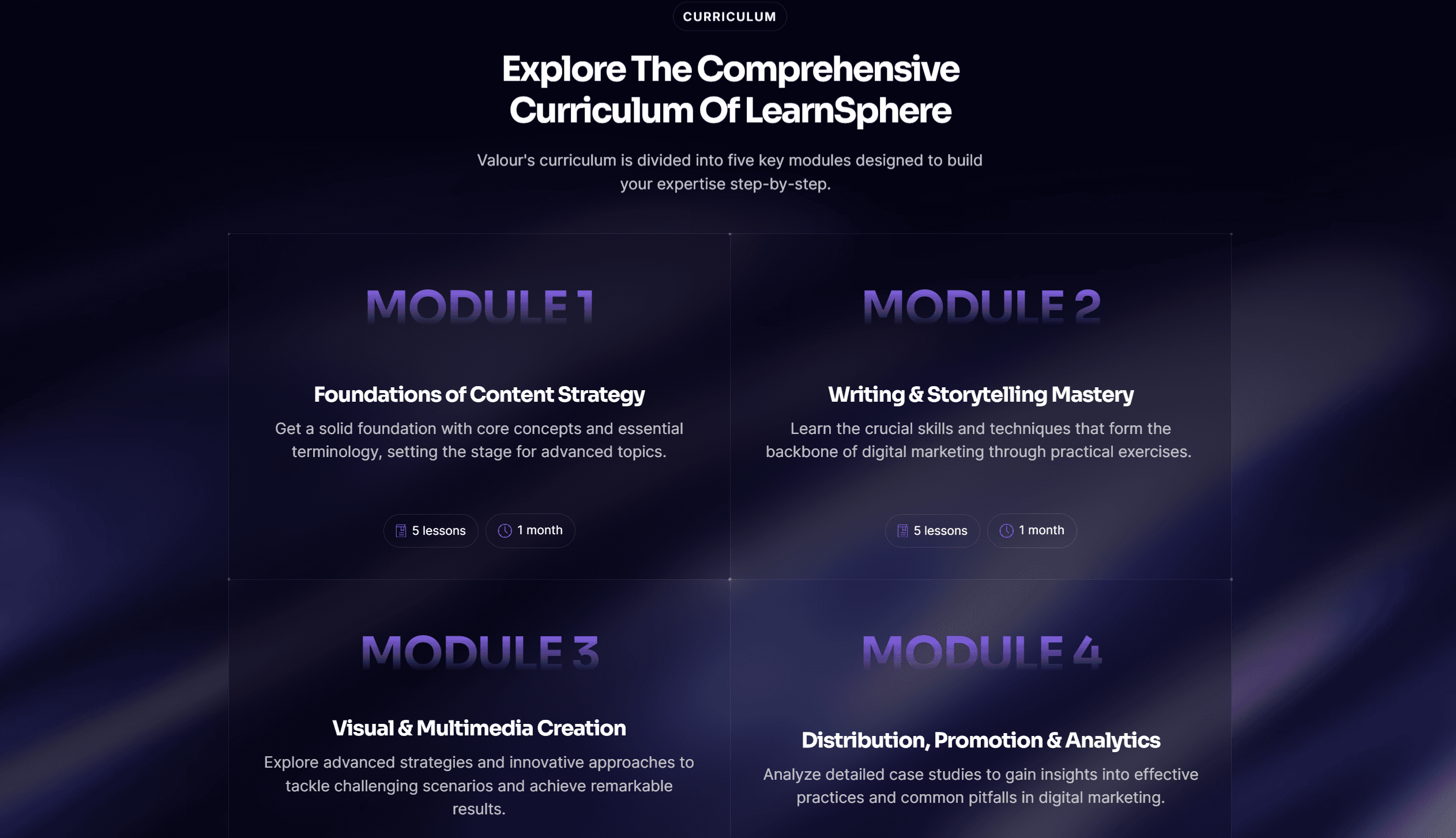
Featured Courses
The courses section uses a responsive, masonry-style grid to present each flagship course as a self-contained card. Every card opens with a crisp, high-resolution thumbnail that visually represents the subject matter—whether it’s a coding interface for a programming class or a sleek infographic for a design module. Below the image, the course title appears in bold, large-type text, immediately communicating the topic. A concise one- or two-line summary follows, highlighting key takeaways (“Master JavaScript fundamentals,” “Design user experiences that delight,” etc.), giving learners just enough context to decide if it’s right for them.
At the bottom of each card, a brightly colored “Enroll Now” button stretches edge-to-edge, using the site’s accent hue to stand out against the neutral background and lower the barrier to action. Subtle hover effects—such as a gentle lift or shadow—signal interactivity, drawing the eye and encouraging clicks. Consistent padding and margin around each card ensure the layout feels open rather than cramped, while uniform typography and iconography tie the grid into the site’s overall aesthetic.
On mobile, the grid collapses gracefully into a single-column feed, ensuring course information remains legible and CTAs remain finger-friendly. By combining clear visuals, succinct descriptions, and a direct path to enrollment, this section not only showcases the platform’s premier offerings but also makes it effortless for prospective students to dive in the moment they’re inspired.
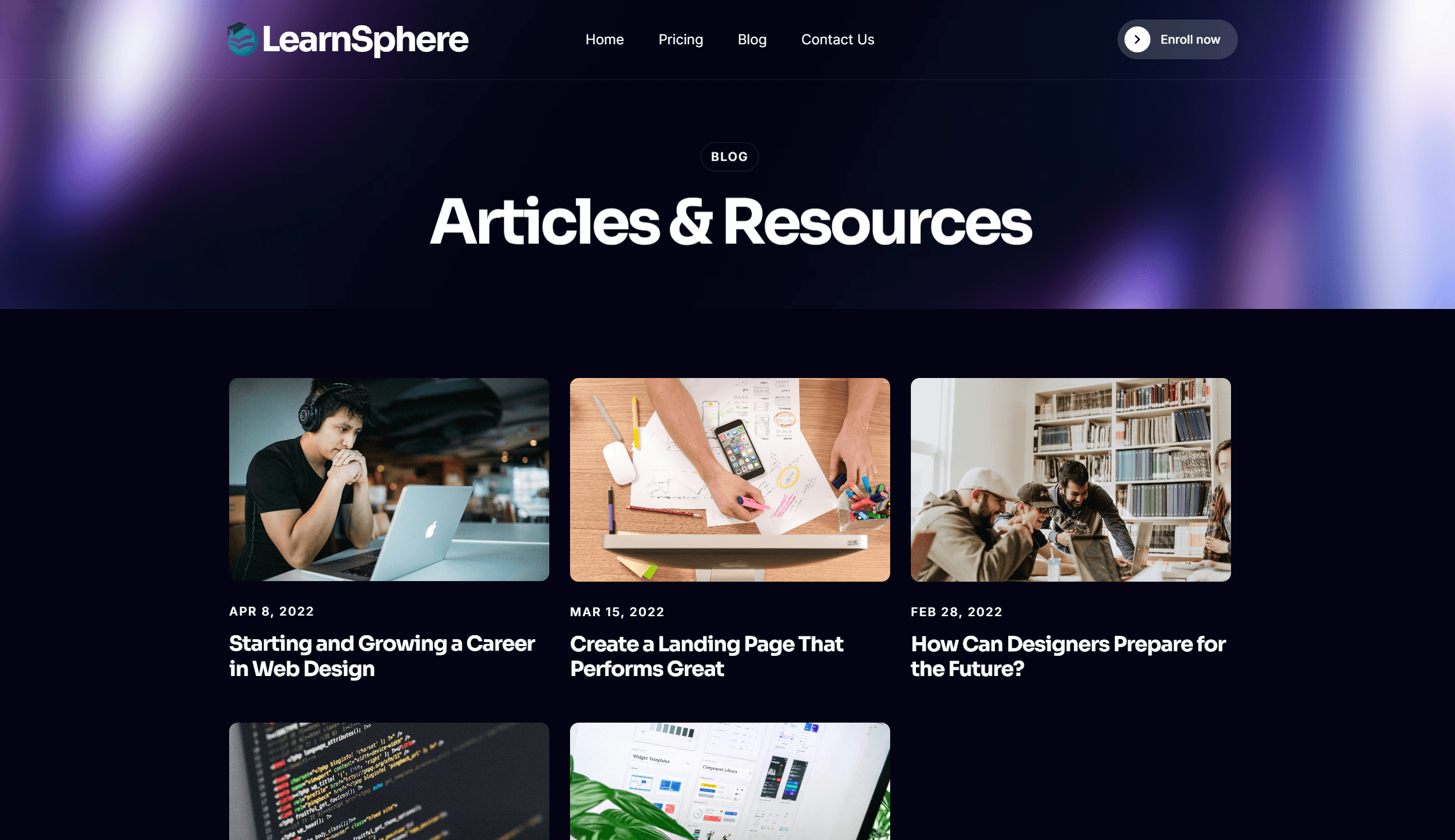
Insights & Articles
The “Blog” section acts as a dynamic knowledge hub, showcasing a curated stream of educational articles that reinforce the platform’s authority and keep learners coming back for fresh insights. Each entry appears as a compact card, complete with a high-quality thumbnail image that visually signals the topic (e.g., code snippets for development tutorials or infographics for design best practices). Just beneath the image, the article title is set in bold, easy-to-scan type, followed by the publication date in a subtler style to convey timeliness. A two- to three-line summary distills the key takeaway—whether it’s a step-by-step guide, an expert interview, or a deep-dive analysis—so readers can quickly assess relevance before clicking “Read More.” Subtle hover animations (such as a slight lift or fade-in of text) invite interaction, while clear “Continue Reading” links ensure seamless navigation to full posts. By blending visually engaging previews with concise, benefit-oriented summaries, this section not only drives on-site engagement but also establishes the site as a go-to resource for ongoing professional growth and thought leadership.
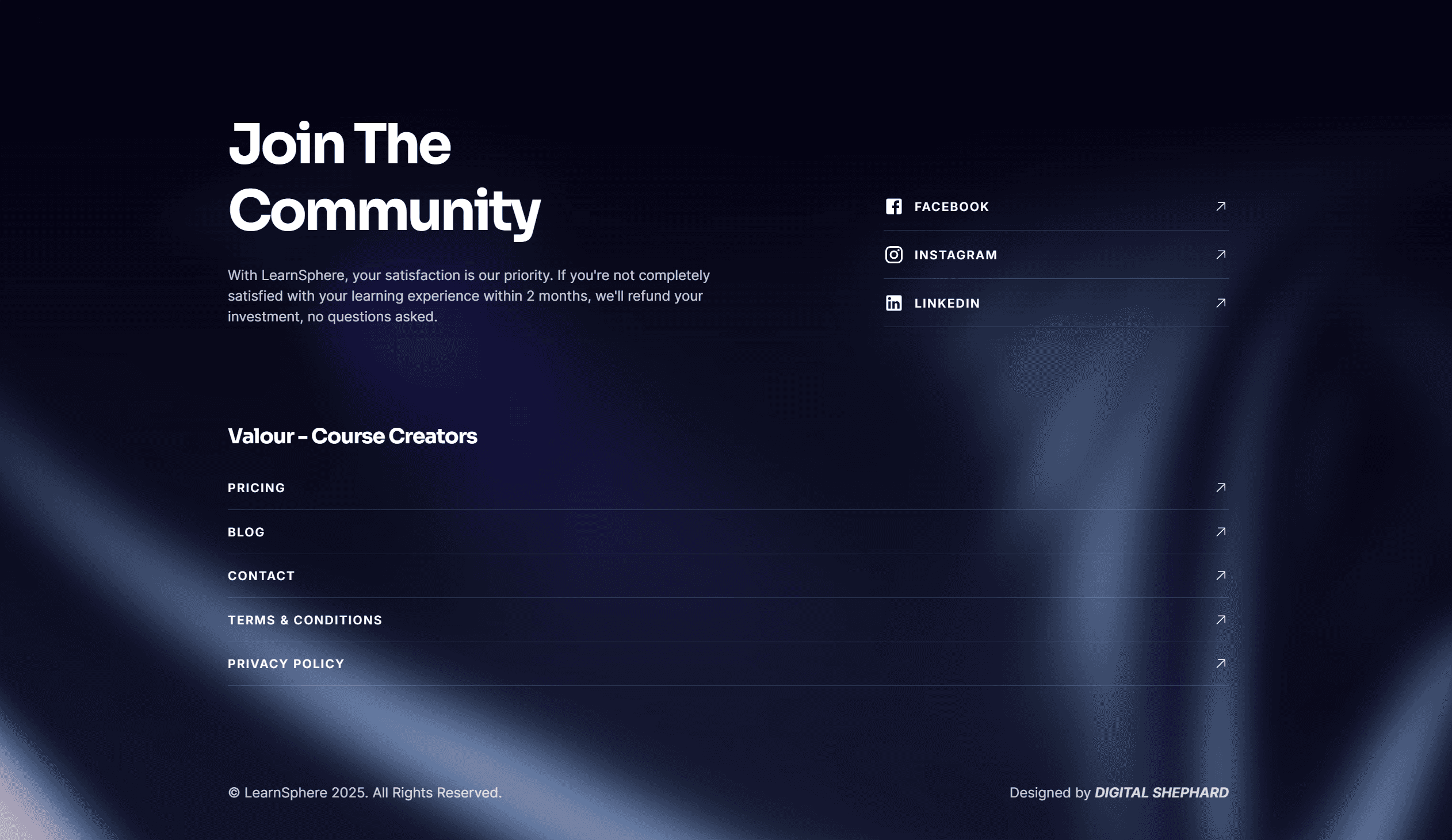
Newsletter & Contact
This section opens with a clear, benefit-focused headline—“Stay Updated”—that immediately explains why users should subscribe. Beneath it, a streamlined email input field and prominently styled “Subscribe” button make signing up frictionless, while a brief reassurance (“No spam, unsubscribe anytime”) eases any privacy concerns. Directly below the form, click-to-email and click-to-call links display your support address and phone number, letting visitors reach out instantly from any device. Flanking these contact methods, neatly arranged social-media icons link to your profiles on Facebook, Twitter, LinkedIn, and Instagram—each with a subtle hover effect to signal interactivity. Generous whitespace and consistent typography tie everything together, turning what could be a crowded footer into an inviting hub for ongoing engagement and support.
